Neith"s Crafty Creations - image created with Club Scrap DigiDeluxe Refresh and Serengeti Kits

Tuesday, February 27, 2007

Ink Your Clay! New Tutorial!

Imagine Card and Jewelry Set

Imagine what you can create when you take the same inks off of your cards and layouts and add them to piece of clay! Learn how to create the jewelry set on this page at moved to this blog, click to get to the post!

Refresh Cuff Bracelet, Dangles Detail

I have a new tutorial up at moved to this blog, click to get to the post that teaches you some of the many ways that you can add ink and embossing powder to polymer clay for your creations! There are also tutorials by me that go over how to Watercolor With a Waterbrush and the Stenciling Revisited class!

Refresh Cuff Bracelet, Pendant, and Earrings

Supplies used on jewelry pieces:
  • Club Scrap: 2/07 Refresh Beads; 8/06 Wheel & Sprocket Beads; 1/06 Framed Beads; 5/03 Aromatherapy Borders & Backgrounds Unmounted Stamps;
  • Ranger: Adirondack Dimensional Pearls in Lettuce; Archival Ink Pads in Library Green & Teal; Archival Reinker in Library Green; Cut n' Dry Foam; Distress Embossing Powder in Peeled Paint; To DYE For in Blue & Green; UTEE Brightz in Blue Iris, Green Zinnia, & Violet;
  • Amaco: Bead Baking Rack; Bead Making Tool Set; Polymer Clay & Craft Oven;
  • Bead & Button: Beading Basics Essential Techniques;
  • Beadalon: 10mm Silver Plated Medium Bale;
  • Blue Moon: Memory Wire Bracelets;
  • Darice: 2" Nickel Plated Head Pins;
  • Design Originals: Clay Techniques to DYE for;
  • Fire Mountain Gems: 4.5mm Silver Plated Jump Ring; Surgical Steel Fish Hook Ball/Coil Earwire;
  • Sculpey: Translucent Polymer Clay;
Supplies used on card:
  • Club Scrap: 2/07 Refresh Dark Green & Light Green plus Spritzer Bottle; 10/06 Farmer's Market Leaf; 5/06 Painted Desert Embossed Stem; 3/04 Culinary Green; 5/03 Aromatherapy Borders & Backgrounds Unmounted Stamps;
  • Krylon: Silver Leafing Pen;
  • Ranger: Adirondack Alcohol Ink Metallic Mixatives in Silver; Adirondack Dimensional Pearls in Lettuce; Archival Ink Pads in Library Green & Teal; Cut n' Dry Foam; Distress Ink Pads in Peeled Paint & Shabby Shutters;

Hand Stitched Journal and Paper Bag Books

I must admit that I'm fairly addicted to making handmade books! I just love this hand-stitched journal project that Club Scrap put out in many designs, inclusing this Paisley version!

Paisley Hand Stitched Journal

Here's a sneak peek at another project! This unique Paper Bag Album skips the lunch bags and goes for a more streamlined Kraft Bag. You will learn to (or practice!) use Japanese Stab Binding while folding extra pockets into your pages.

Japanese Stab Bound Paper Bag Pocket Album

You can choose to seal your pockets' edges with additional stab binding, simple whipstitches, brads, eyelets, staples, etc! And, the class can, optionally, come with additional supplies to fill the pages with coordinating papers and prints! I've actually left the threads long on my Textiles & Notions cover because I want to add some sewing themed charms to the tails! This little book will be wonderful for scrapping about my children's knot tying lessons with Scouts, the girls' Sit-Upons, my son's Cross-Stitching, and the gorgeous Korean Gwi Ju Meoni pouches that my children just made!

Japanese Stab Bound Paper Bag Pocket Album


Friday, February 23, 2007

Monoprinting: a great way to have bursts of color on your work!

Monoprinting with the Ranger Non Stick Craft SheetClub Scrap Painted Desert and Road Trip Kits

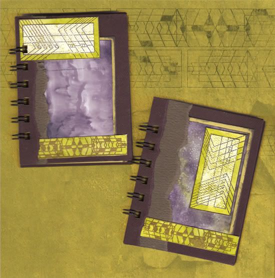
When I first was reading about this technique, with its proper name, it involved using specialized monoprinting sleeves... I improvised by using a pair of write on transparencies. But, I have since learned that it is soooo much easier to use the Ranger Non Stick Craft Sheet (which I already use every time I ink and glue)!

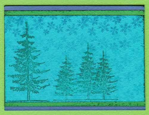
The ATC, in the right hand image above, was created with the transparencies, Club Scrap 3/05 Road Trip White Paper, Club Stamp 5/05 Painted Desert Unmounted Stamps, Ranger Black Pigment Ink & Black Embossing Powder (the edges of the ATC are inked and embossed also), and ColorBox Ancient Page Harbor, Lime, & Neptune Inks. I applied inks to the paper by dripping reinkers, one color onto the papers at a time, onto a transparency and used the ColorBox Stylus to spread it out, then sandwiched a blank transparency on it and pressed unevenly. I then spritzed the side of the transparency that I was using with the Ranger Perfect Ink Refresher and laid the cardstock onto the damp transparency. I sandwiched the transparencies again and used a brayer to press the ink into the paper. I then repeated the process with the darker ink.

Club Scrap 2/07 Refresh Club Stamp KitBasically you can press Ink Pads onto the craft sheet, drip and drizzle Reinkers on it, pounce ink on, smear glitter glue onto it, add Paints, drip or draw onto it with Alcohol Inks, dilute with Alcohol Blending Solution or even spritzes of water (for water based inks) and then take your intended project surface and press it onto the inks, swirl or swipe as you lift and marvel over the finished piece! You can also press portions of the Non Stick Craft Sheet onto itself before adding the inks to your project to get more of an ink blot effect! Glossy Paper is wonderful for this technique, but anything will do! The glossy surface just helps the ink travel and fills the paper better.

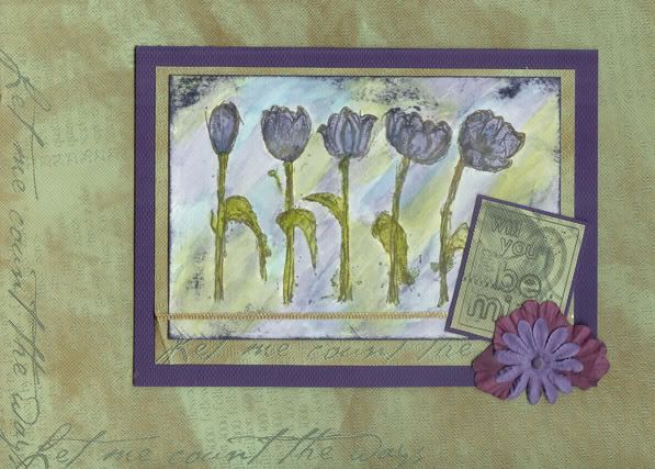
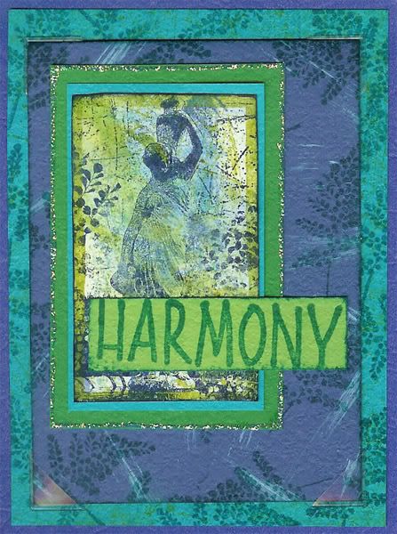
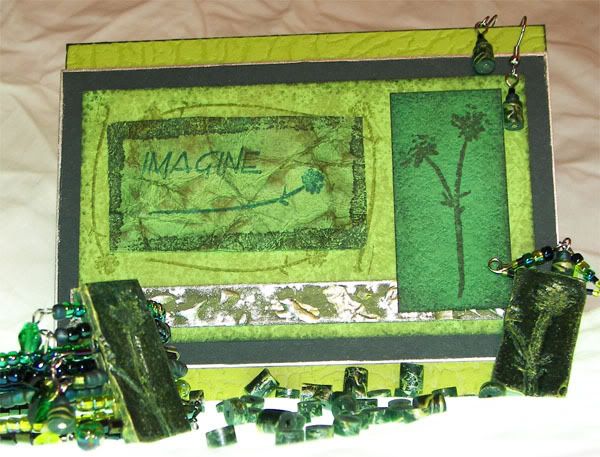
In the ATC to the right and in the title image for this Blog entry, I used a combination of Ranger Alcohol Inks in Lettuce & Stonewashed, Ranger Alcohol Blending Solution, and Ranger Stickles in Waterfall to create a backdrop for the stamped scratch marks, frame, and focal image. On the ATC, I used also Ranger's Aqua Adirondack Paint Dabber, Adirondack Bottle, Lettuce, & Stonewashed Ink Pads, and Archival Cobalt & Teal Ink Pads as well as Club Scrap's Glossy Paper plus the 2/07 Refresh Kit's CSt UM Stamps, CSt WM Statue & Fern Collage Stamp, Dark Blue, Light Blue, Dark Green, and Light Green Papers.

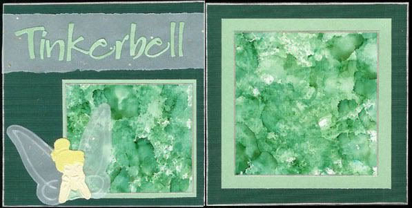
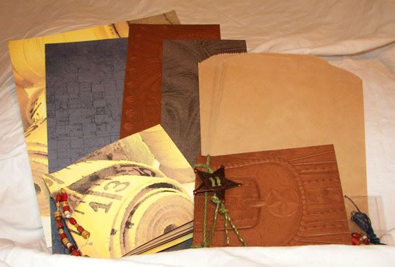
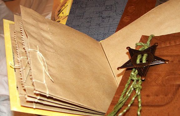
The mattes in the layout below were created with Glossy Paper and Alcohol Inks using a combination of monoprinting and direct pouncing with Alcohol Inks. I dry embossed Tinkerbell with a Plaid Embossing Stencil. The papers are all Club Scrap, using the Mint Frost and Cream Frost from the 1/04 Asian Artisan Kit, and unfortunately unlabelled other CS papers. (I didn't post details in the past!)

Club Scrap

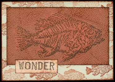
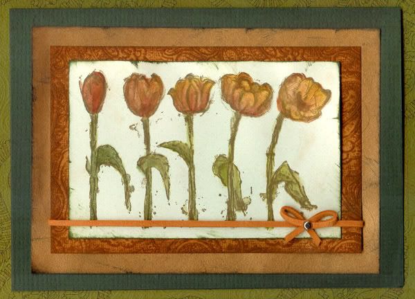
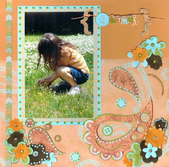
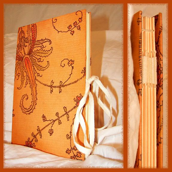
Below is another sample made with alcohol ink monoprinting, as you can see in the upper right, eventually the colors will blend all the way, simply soak it up and add new inks! I misted rubbing alcohol onto the Glossy Paper and onto the craft mat, dripping Alcohol Inks at random. Then I laid the Glossy Paper face-down on the inked mat and swirled, swiped, and lifted. I used Club Scrap's 9/05 Science Unmounted Stamps, 7/05 Wings Apricot Paper, and Glossy Paper along with Ranger's Non Stick Craft Sheet, Adirondack Alcohol Inks in Butterscotch, Caramel, & Terra Cotta, and Adirondack Ink Pads in Butterscotch, Caramel, Rust, & Terra Cotta.

Club Scrap 9/05 Science Kit and 7/05 Wings Kit

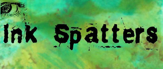
Below is the new logo for my tutorials at Diversity Designs! I applied small "spatters" of Ranger's Alcohol Inks in Bottle, Lettuce, and Stream to the Ranger Non-Stick Craft Mat, added the Alcohol Ink Blending Solution, then took Glossy Paper and pressed it onto the sheet, swirling and lifting until the paper was well covered. I added more ink and targeted the white areas. After the paper was filled with ink, I added a little Adirondack Metallic Mixatives in Copper to a felt applicator and pounced away! The black art work is a self portrait of me that was then altered by Roselyn!

Ink Splatters Banner, Created With Alcohol Inks

Tim Holtz also teaches a version of this with his Distress Inks and calls it Wrinkle Free Distressing. With it, you will often spritz the craft sheet or your project material with water and then iron your finished piece to keep the wet work from warping. Ranger has posted one project with instructions for a Monoprint Card plus Distress Ink Tips. Pennywise Arts has a great online class on Monoprinting with Alcohol Inks.

Weekly Tips, Techniques, Tools, & Ideas!

Over on Scrapbook Takeout's Message Board, each week, I post at least one Stamping Related "Tip, Technique, & Idea of the Week" or TTI of the Week.
And... each week, on Tuesday, Audrey and I post a "Tool of the Week". We trade off the job and keep the thread at the top until the week is up!
We'd love it if you would post things that you have created with that technique or tool, experiences with it, questions, links to discussion on it, anything that it makes you think of!


Wednesday, February 21, 2007

Korean Layout: Ko-Chu-Neun Chag-A-Do Maep-Tta!

Club Scrap Digital 01/07 Fizz and 11/06 Interior Design with Batang font

The title for the layout comes from the book Tigers, Frogs, and Rice Cakes: A Book of Korean Proverbs By Daniel D. Holt. Ko-chu-neun cha-ga-do maep-tta translates to "Though it is small, the pepper is hot." Basically, good things come in small packages! You can go to my Myspace Blog to see some other photos of events from that weekend's Korean/Chinese/Lunar New Year's festivities at the Peabody Essex Museum!

I created this digital layout using the Club Scrap Digital Kit 01/07 Fizz. I wanted to work in the blue from their outfits, so I altered the hue and saturation of the background paper. I also flipped and resized many elements, cut and pasted from the Patterned Dark Pink Cardstock in order to make a fully bordered matte, and added drop shadows and pepper frames. The font is Batang and made use of the Hangul Character Mapping on this site.

Tuesday, February 20, 2007

Happy New Year! (plus the winner for "What Inspires You")

It is time for me to name a winner in my "What Inspires You" Contest! I just used random.org to pick a random winner... and it is Audrey! Congratulations! I'll be sending you a little Club Scrap treat very soon!

Continuing to be inspired, I dug around in some magazines and took a few very fast digital shots of layouts that I liked from the advertisements and the magazine pages. Here is one ad-inspired layout, with photos from this weekend's Korean New Year's celebration!


Gwi Ju Meoni - CSD 11/06 Interior Design

Ad-Inspiration: Emma Gardner Design
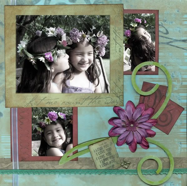
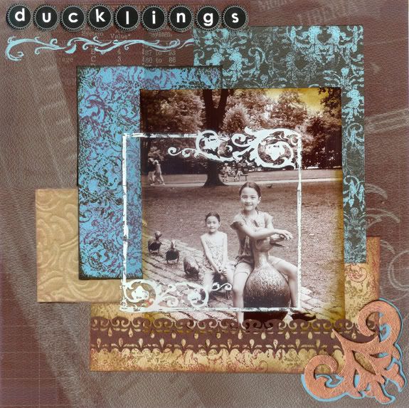
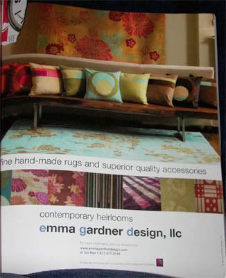
I used this Emma Gardner Design, Llc ad as my inspiration for my digital layout.

The bags in the top image were all sewn by my children in a class with Keumjoo Ahn and JY Isabel Kim at the
Peabody Essex Museum on February 18, 2006! They are called Gwi Ju Meoni, translated to Ear Pouch, because of the triangular ear-lobe shapes on both sides of the bag. The instructors had already made the dragonfly shaped knots, Mae Deup, for us!

We've already bought some fabric to make American Girl Doll sized pouches with coordinating outfits for the dolls and my girls! I'm not sure if this is a project that will have to wait until summer vacation though!

I used Club Scrap Digital 11/06 Interior Design Kit with Batang font. The text is by Keumjoo Ahn and translated by JY Isabel Kim.


Thursday, February 15, 2007

Be My Valentine

100 Things Cover, Club Stamps 01/07 Fizz Project

A friend inspired me to make my husband a list of one hundred things that we love about him. And, since I was dying to play with the latest Club Stamp 01/07 Fizz Stamper's Project: Pocket Book, I decided to combine them!

The project combines a CD Literature Envelope with a host of embellishments and a variety of suggestions for how to use them! I chose to use the simple accordion spine, slid into the pockets of the CD Literature Envelope to make a small book with 6 inner pages.

I took advantage of the semi-glossy covers on the CD Literature Envelopes to apply Ranger Adirondack Cranberry Alcohol Ink to them, diluted with Ranger Alcohol Blending Solution. I then embellished the covers with additional Club Scrap 01/07 Fizz items including Club Stamp Cutouts, Circle My Heart Stencil, American Craft Silver Metallic Marker, and papers in Black, White Translucent, Dark Pink, and Light Pink. I also used Club Scrap Valentine's Day 2007 Love Stamp, Stewart Superior Palette Hybrid Ink Pad in Noir Black, Score-It, ColorBox Stylus Tool with Sponge Tips, Ranger Black Soot Distress Ink Pad, Pink Venice Daisy Ribbon, Moda Dea Ticker Tape Art. R117 in Pink Passion, and Scrapbook Takeout 02/07 Spring Fling's Prima Petal Poetry & Fancy Pants Biggest Board Chipboard Flourishes.
100 Things Cover, Club Stamps 01/07 Fizz Project

On the inside of the book, I also used Club Scrap 01/07 Fizz's Still Love You Tomorrow Sr Heart Stamp, CSt Circles & Heart Collage Stamp, CSt Crazy About Fizz UM Stamps, & American Craft Black Precision Pen, VersaColor Orchid Ink Pad, Sizzix Skooshy Font, plus Scrapbook Takeout 02/07 Spring Fling's Doodle Rubber Stamp Sheet.

Not one to leave my children out of the love, I made the following Valentine's! The girls each received one of the Fizz cards on the left, filled with gushy text inside, while Sebek received the non-traditional 2007 Valentine's Day Kit card on the right.

Three Fizz Love Cards and One Valentine's Day Kit Card

To make the girls' cards from the Club Scrap 01/07 Fizz Kit, I used the Score-It Tool to emboss horizontal lines in the Dark Pink paper every 1/4" and then used direct-to-paper inking with the Stewart Superior Palette Hybrid Ink Pad in Noir Black. I tore strips of Black and White Translucent paper, then edged the white with Ranger Black Soot Distress Ink on my ColorBox Stylus with Sponge Tips. I used the American Craft Silver Metallic Marker with the Circle My Heart Stencil to add the word "love" and I also inked the edge of the scored paper. For one last embellishment, I used the small heart from the CSt Crazy About Fizz UM Stamps on Light Pink paper.

On my son's card, every element is from the 2007 Valentine's Day Kit. I took on a journaling challenge in which I had to write all of the personal sentiments on the outside of the card! On the inside I used the two sentiment stamps from the kit and signed the card one last time!

The kids also had to make 94 Valentine's for their friends and teachers! We managed to make them all for under $10 (if you don't count the ink and the Club Scrap DigiGoodies 02/07 Fizz Kit that Uatchet used to design the insides with)!

Children's Valentine's Cards 2007

This is another batch of cards using the Club Scrap 02/07 Fizz Kit. We used thin strips of either Dark Pink or Light Pink paper from POPs as our base with a printed digital scrapbooking design, on the inside, by my 7 year old daughter, Uatchet! Using factory assembly line style production, we used the Score-It and a Bone Folder to quickly crease and fold all 94 cards, we taped down a strip of Offray Black Feather Edge Satin Ribbon, covered it with a small square of Black paper, and a single flower from just under 2 yards of Pink Venice Daisy Ribbon before tying a bow!
Children's Valentine's Cards 2007


Saturday, February 10, 2007

Talkin' 'Bout My Generation

Have you ever had just the one perfect ink pad for a project but needed more than one color? What about an entire palette of perfect shades but you need a more subtle background piece? Or just a pale background without the right pale ink pads? Ever had the impulse to create the look of motion in your stamped piece? Well Multi-Generational Stamping may be just the thing for you!

A First Generation image is when you ink your stamp and stamp directly onto your project. A Second Generation image is when you ink that stamp, stamp one onto your project or scratch paper and then stamp onto your project without reinking. Third Generation stamping is when you stamp a third time without reinking, and so on. You can vary how much ink you remove with each stage by varying the pressure that you apply.

http://img.photobucket.com/albums/v624/neithj/cards/FossilsWonderCard.jpg

With this project, the background is made with only one stamp and one ink pad! The same Ranger Adirondack Rust Ink Pad was used to distress and shade the other two papers and their images were stamped with Ranger's Walnut Stain Distress Ink.

The stamps are all from Club Scrap Fossils 8/04 as are the two smaller papers. The background paper is Club Scrap DIY 2003's Kraft.

http://img.photobucket.com/albums/v624/neithj/cards/MochaBdayCard.jpg

On this card I wanted to use my inks at full strength on the piece with the coffee cup, but more subtly for the background matting. To do so, I applied the inks, full strength, direct from the pad to the edges of the smaller piece and then inked the coffee stain stamp with the same inks but first stamped them lightly on scrap paper to get a Second Generation image.

I used Club Scrap Ivory Elegance 12/06 papers in Ivory, Beige, Dark Brown, & Light Brown along with the Mocha Java 11/02 Sr Woodmounted Stamps & Birthday Wood Mounted Stamp. The inks are Clearsnap's Fluid Chalk Ink Pad in Alabaster and Ranger's Adirondack Ink Pads in Caramel, Espresso, Ginger, and Latte.

The image “http://img.photobucket.com/albums/v624/neithj/cards/AutumnSeasonCard.jpg” cannot be displayed, because it contains errors.

This card uses only Second Generation stamping for the full background and a separate ink for the sentiment. I wanted the leaves very subtle, so I pressed hard when I did the First Generation stamping on my scratch paper.

I used Club Scrap Ivory Elegance 12/06 papers in Ivory, Beige, Dark Brown, & Light Brown along with Autumn Splendor 10/04's unmounted stamps and Refresh 2/07's Delicate Forest Paper Leaf. The inks are Clearsnap's Fluid Chalk Ink Pad in Alabaster and Ranger's Adirondack Ink Pads in Caramel, Espresso, Ginger, and Latte.

http://img.photobucket.com/albums/v624/neithj/cards/RefreshWheelsCard.jpg

This card is just one example of using Multi-Generational Stamping to create a slight illusion of motion. Stamp your image at full strength and stamp subsequent generations behind it until the image is very much faded away. You can overlap the image or have them separated, even add motion striping if you wish!

This card uses Club Scrap Wheel & Sprocket 8/06's unmounted stamps combined with Refresh 2/07 Greetings to Go and papers in Light Blue, Dark Blue, Light Green, and Dark Green. The inks used are Ranger's Adirondack Ink Pad in Stream and Archival Ink Pads in Cobalt, Library Green, & Teal.

Thursday, February 8, 2007

2 More Challenge Layouts and 2 Cards!

Here are two more layouts that I created for challenges at the About.com Scrapbooking Forum. And two cards with remnants from the second layout.


One is a simple digital layout using the Club Scrap Digital 1/07 Fizz Kit. The other layout is loaded with items from the latest Club Scrap 2/07 Refresh Kit, the latest Scrapbook Takeout 2/07 Spring Fling Kit, a little stamping, a little diecutting, some bargain ribbon, and 4 old unused patterned papers from my stash. Then I created two cards from the scraps of the second layout!


NYC

Club Scrap Digital Fizz 2/07 Kit; Hans Hand Font for title, FG Maja Font for journaling;

Ann Marie is hosting weekly challenged based on Elsie Flannigan's work. Her first one was for people to journal on little strips... You know that the intention was for all those little loose unanchored pieces that float all around... Some with one word, some with many, like the fridge poetry pieces... But it wasn't stated that way ;) and it's not really me.

I did intend to make this as a paper layout and may well do so later... But for now, I completed a digital version! And yes, the photo was taken from inside my moving minivan while hubby drove! I couldn't tell you the setting because I just flipped thru all the potentially good ones and took a shot with each twice, hoping for a decent one! We were out of the city each of the other nights on this trip (over the bridge to family in Fort Lee) and only popped across to drop my brother in law off. hubby wasn't in the mood to let me get out and snap pics when we had a long drive home with school & work the next day!

Beautiful: Uatchet & Damselfly

Supplies Used:
  • Club Scrap 2/07 Refresh: Fibers, Fandangles Sequins, Embellishment Pack Brads, and Plain Papers in Dark Blue, Light Blue, & Dark Green;
  • Scrapbook Takeout 2/07 Kit: Fancy Pants Biggest Chipboard Flourishes, Fancy Pants Vintage Summer Ribbon, Unmounted Stamps, and Prima Petal Poetry Flowers & Quick Picks;
  • 4 Prints from Slab 6 Rob & Bob Studios;
  • AC Moore Bargain Ribbon and Silk Flowers;
  • Ranger Green Embossing Foils and Black Perfect Medium Ink Pad;
  • Stewart Superior Noir Black Palette Ink Pad;
  • Zig Writer in Pure Black;
  • Sizzix Skooshy Font;
I combined a number of different challenges to make this one layout! I was still reeling from the flu and a migraine and just wasn't sure how long I could sit up... What is left to do but lay there and think, then sit up for one big burst of creativity?

The Patterned Paper Challenge called for at least 3 patterned papers, 1 photo, a title, journaling, and brads or buttons. The Bling Challenge called for anything shimmery/sparkly and I accomplished this subtly with the Embossing Foils and Fandangles. A Numbers Challenge required at least 10 flowers, 10 eyelets or brads, and 4 different ribbons. A Tag Challenge demanded a tag that was at least 2.5"x3", including patterned paper, a stamped image, a word, 3 flowers, and fiber or ribbon, this was done through my title tag (I'm not a big traditional tag kinda gal). The Journaling Challenge that I used required that you not talk about the who, where, or what of the image that you used, but rather something that it represents to you or how it makes you feel. And as a starting point, I took on Rebecca Luden's Sketch Challenge, squishing her double page layout into a single page design, dropping my elements onto it and rearranging a tad.

At first I was thinking that I would just use some of the old patterned paper in slabs which have sat untouched for ages, with maybe 3 sheets used out of each! I have found that these papers just aren't me enough, but because I've owned them for so long, I really must try to use them now and again. When I do, it's usually as a simple backdrop for stronger, richly colored elements. Before my newest Club Scrap Kit had arrived, I just had the 4 patterned prints sitting there along with the Primas, but the colors just faded into one another, so I set it aside until I had time to look for other papers.

Well the Club Scrap 2/07 Refresh Sr Kit arrived with perfect timing! I pulled out those rich strong greens and blues, finding the perfect solids and finishing embellishments to really make the design pop! I even used my POPs (Pound of Paper, precut into smaller pieces) as is for the main matting and trimmed slightly for the title tag and side tag/elements. Then I pulled out the gorgeous ribbons from the kit's fibers and everything made sense! The Numbers Challenge had to be added! And it created a way for me to use those three 4"x6" POPs for the main matte in a coherent way as well as unifying the three colorblocked background segments. And with the perfect green, teal, and blue minibrads, the Numbers Challenge was completed... But those adorable little ridged Fandangles also wanted in... So they dictated that my swirling stamps should be shimmery and work towards the Bling Challenge. I edged every paper in black ink, tried to journal in a consistant look with the die cut font, and there you have it!

Please do forgive me for the jagged job of stitching together 4 scans of the layout from different corners... the 3 dimensional embellishments did not allow the images to properly align and *gasp* the photo isn't really on the layout yet as my printer needs new colored ink! I will try to replace it with a photograph soon!


Supplies Used:
  • Club Scrap 2/07 Refresh: Fibers and Plain Papers in Dark Blue & Dark Green;
  • Slab 6 Rob & Bob Studios;
  • AC Moore Bargain Ribbon;
  • Stewart Superior Noir Black Palette Ink Pad;
  • Sizzix Skooshy Font;
  • Staples;
  • MAMBI Hearts Stickers GGR-33;
On this card I was busy combining challenges as well! The Tag Challenge that I used required a t least one each of a sticker, die cut/punchie (including fonts), and metal embellishment, while there was a call to use our Patterned Paper Challenge scraps to make a card, and to make a card for every month of the year!


Supplies Used:
  • * Club Scrap: 2/07 Refresh Plain Papers in Dark Blue, Light Blue, & Dark Green (scanned on the Light Green) plus Kit Fibers; Christmas 2006 B&B UM Stamps;
  • Ranger Bottle Adirondack Ink Pad and Sailboat Blue Sea Brights Ink Pad;
I used the scraps again and created a January winter-themed card. I used multi-generational stamping to have the snowflakes fading away. To do this, ink your stamp and stamp once at full strength. Ink it again and first, very lightly, tap the stamp onto scrap paper before stamping onto your piece.... continue to do so, increasing the amount of ink that you stamp/tap away onto scrap paper before adding it to your piece.

I hope that you have enjoyed them!

Tuesday, February 6, 2007

What Inspires You? Share & You May Win a Prize!

A common question on all scrapbooking message boards seems to be "What inspires you?" The answer is different for everyone and can vary over time.

For some it is simply their own photographs, for others supplies inspire the design. Many more will look at creations made by others in order to spark their own creativity. Take a trip over to the bookstore and you will find countless magazines and even books filled with layouts and with design tips. There are many color picking tools/wheels to help you select color schemes. (There is of course the wealth of coordinating items that come in kits like Club Scrap's Kits...) Also look in that same magazine aisle to find beautifully laid out magazine pages, both articles and advertisements, and allow them to inspire a layout or two! Go online and countless resources open up to you...

You can find message boards where you share directly with the people that you chat with. Many sites have special events and challenges to help kick start your creativity and offer up prizes! One wonderful way to do this is to frequent boards made for fans of your favorite companies! There are also websites for all the magazines and more generic scrapbooking boards and galleries. Blogs are also a wonderful resource.

In the next few weeks I will be adding a number of inspiring links to the bottom left of my blog pages and would love if you would post your favorite points of inspiration in my comments! On February 20th I'll draw names from a list of everyone who commented with a link and I will send you a little prize... so make sure that I have a way to contact you for your address!

In the meantime I would like to share a few creations that I made for this past weekend's Crop-O-Rama online crop at About.com's Scrapbooking Forum! You've already seen one layout and 4 cards (including one that used this
Color Scheme Generator thanks to Shakira's wonderful link), but here are two digital layouts... also inspired through Shakira! She posted a series of Advertisements for us to base our designs on... often I will take a sketch and really warp it in my final creation... but I stayed pretty true to the layouts this time!


Giving CSD 2/07 Fizz Layout

On this layout I used Club Scrap Digital Deluxe/Goodies 2/07 Fizz Kit along with FG Vanda Font, and Photoshop Elements 5.0's Pepper Frame, Drop Shadows, and Outer Glow functions. (All of the page elements except for the button "G" are available as part of the physical 2/07 Fizz Kit!)
Ad Inspiration for Giving CSD 2/07 Fizz Layout


Wellfleet Free Day CSD 11/06 Interior Designs and 12/06 Ivory Elegance Layout


Ad Inspiration for Wellfleet Free Day CSD 11/06 Interior Designs and 12/06 Ivory Elegance Layout
With this simple and clean layout, I used Club Scrap Digital Deluxe/Goodies 11/06 Interior Designs Paper with Club Scrap Digital Deluxe/Goodies 12/06 Ivory Elegance Transparencies and Monoscript Corsiva Font. Through Photoshop Elements 5.0, I adjusted the Hue/Saturation of the Light Brown Cardstock to create the 3 alternate shades of paper. (All of the page elements except for the button "G" are available as part of the physical 11/06 Interior Designs and 12/06 Ivory Elegance Kits!)


Neith's Crop-O-Rama 2007 Creations

Saturday, February 3, 2007

Tulips In A Row Stamp

Ok, I am just loving this stamp... such a great card base... So today I'll be adding more and more cards made with it but using alternate color schemes.

Rusted Tulips

A very good way to use a stamp like this is to stamp it with Ranger's Archival Ink Pads in your choice of colors... I like to use a brown because it doesn't interfere with the colors of the leaves or petals and isn't as glaring as black... but sometimes black is good ;)


Then take your Niji Waterbrush and use an Adirondack Ink Pad (also the older Ranger Sea Shells and Sea Brights which are being re-released as Adirondack pastels and brights with a few new colors) to color the images. These pads feature a hinged lid which easily burps color off of the pad into the top of the lid by pressing down on the center... then you can pick up that color with a waterbrush. Alternately, you may press any water-based ink pad against the Ranger Non Stick Craft Mat to pool some ink. The Distress Inks are great for this... but if you move into other brands or work with a non-distress black then your colors may separate into their composite colors.

Club Scrap Nature's Wonders 5/06 and Wheel & Sprocket 8/06

Supplies Used On Rusted Tulips Card:
  • Club Scrap: Nature's Wonders 5/06 Tulips in a Row Sr Stamp; Asian Artisan 1/04 White Plain; Paisley 3/07 Burnt Orange Plain; Color in Black & White 4/06 Copper Plain; Farmer's Market 10/06 Brown Plain and Orange Fibers;
  • Ranger: Adirondack Ink Pads in Butterscotch, Lettuce, Oregano, Pesto, Red Pepper, & Rust; Archival Ink Pad in Coffee;
  • Stewart Superior Noir Black Palette Ink Pad;
  • Niji Waterbrush;
  • Gartner Studios Hot Hues Brad;
Supplies Used On Pastel Pink Tulips Card:
  • Club Scrap: Nature's Wonders 5/06 Tulips in a Row Sr Stamp; Fizz 1/07 White Translucent, Silver, Black, Dark Pink, and Light Pink Plain Papers;
  • Ranger: Jet Black Archival Ink Pad; Seashells Tropical Raspberry and Starfish Green;
  • Zig Pure Black Writer;
  • Niji Waterbrush;
  • Coats Moda Dea Ticker Tape Art. R117 Color 9722;
Supplies Used On Bright Tulips Card:
  • Club Scrap: Nature's Wonders 5/06 Tulips in a Row Sr Stamp; Fizz 1/07 White Translucent Plain Paper; Wheel & Sprocket Green Translucent and Purple Plain Papers (scanned on Green & Translucent)
  • Ranger: Jet Black Archival Ink Pad; Adirondack Ink Pads in Butterscotch, Currant, Lettuce, Terra Cotta, & Wild Plum; Sea Brights in Awning Green, Bikini Pink, & Purple Surf;
  • Niji Waterbrush;
  • Coats Moda Dea Ticker Tape Art. R117 Color 9815;

Friday, February 2, 2007

I Love You. I Love You. I Love You.

I Love You. I Love You. I Love You.


Be Mine?

If you couldn't guess already, I adore the set of photos that I used on the layout! I've blogged it, I've made a mini page for a Multicultural 6x6 Layout Swap (the wreaths were made as part of learning about Swedish Midsommar celebrations), I've even put it on a mug! But this is my first layout of it for our album!

Unfortunately, the scan does brighten the blue ribbon and the painted chipboard... in real life they are more muted! Anyhow... I created this layout as part of the weekend's Crop-O-Rama at About.com's Scrapbooking Forum! We were challenged to have specific numbers of certain page elements! Here are the contents!

5 Embellishments:
  1. Scrapbook Take Out 2/07 Kit Fancy Pants Biggest Board Chipboard Flourishes
  2. Club Scrap Let Me Count The Ways 2/06 Sage & Dark Cherry Printed Cuts
  3. Club Scrap The Written Word 11/05 Decorative Tape
  4. Making Memories Pewter Decorative Brads
  5. Making Memories 1/8" Pewter Snap
4 Papers:
  1. Club Scrap Let Me Count The Ways 2/06 Aqua 12"
  2. Club Scrap Let Me Count The Ways 2/06 Sage 8.5"
  3. Club Scrap Let Me Count The Ways 2/06 Dark Cherry Solid
  4. Club Scrap Let Me Count The Ways 2/06 Light Cherry Printed Matte
3 Pictures - Desaturated but the color was added back to the blossoms.

2 Types of Ribbon:
  1. Scrapbook Takeout 2/07 Kit Fancy Pants Vintage Summer Ribbon
  2. AC Moore Bargain Ribbon
1 Big Flower:
  1. Scrapbook Takeout 2/07 Kit Prima Petal Poetry Flowers & Quick Picks
Inks - Ranger: Coffee Archival; Latte & Raisin Adirondack Ink Pads; Aqua & Lettuce Adirondack Acrylic Dabbers; Clearsnap: ColorBox Chiffon White;

I inked the edges of all the mattes and then I painted the chipboard with the Lettuce first, then inked it with the Latte and Chiffon White Ink Pads, allowed it to dry and then swiped small specks of Aqua paint and wiped off most of the Aqua. In real life it matches the layout very nicely!


I used scraps from the layout to create a card! Both work towards this weekend's Crop-O-Rama online crop at About.com's Scrapbooking Forum... but the card is covering a few challenges!

First, I used this Color Scheme Generator to pick my colors. I used #88974E and the Harmonious Colors of #4E6497 and #814E97 to come up with a sage, a denim blue, and an eggplant purple, then went to work on the stamped image.

Using Ranger's waterproof Archival Ink, I stamped the image and then colored in the image with my Niji Waterbrush & Adirondack Ink Pads, diluting the same inks for the background and then edging the paper directly with a pad. I hunted around for leftovers and added a new strand of fiber and a snap to finish it off!

Supplies are:
  • Club Scrap - Nature's Wonders 5/06 Sr. Tulips In a Row Stamp; Let Me Count The Ways 2/06 Sage 8.5" Print & Sage Cuts; Wheel & Sprocket 8/06 Purple Plain; Culinary 3/04 White Plain;
  • Scrapbook Takeout 2/07 Prima Petal Poetry Quick Pick Flowers;
  • Ranger Adirondack Ink Pads in Denim, Eggplant, Lettuce, & Pesto; Ranger Archival Ink Pad in Coffee;
  • Niji Waterbrush;
  • Making Memories Grape 1/16" Snap
  • Crop-A-Dile
  • Katia Sevilla #29 606117